Overview
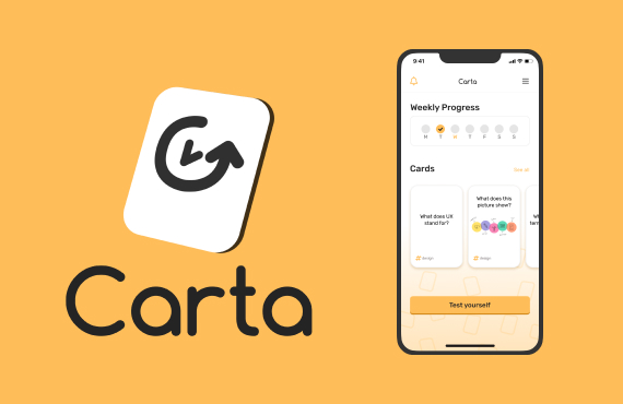
Carta, a flashcard app, was designed to give users the ability to learn new vocabulary and concepts by employing the power of spaced repetition.
ROLE
UX Designer
TOOLS
Photoshop, Keynote, Pen & Paper
TIMELINE
4 weeks
The Process
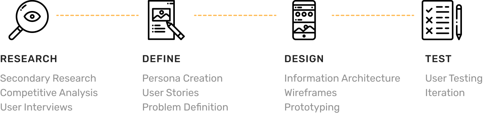
Research
Research Goals
I started by planning the research to find out how to structure it and what information to collect that would eventually assist in offering an incredible user experience. I determined the following research goals essential for creating a great product:
- Find out what makes Spaced Repetition effective
- Discover the habits, motivations and pain points of people who're learning
Secondary Research
The first step was to familiarise myself with the topic, so I took online to do a bit of secondary research, reading studies, papers and dedicated forums. I learned about the following:
- Writing good prompts is not easy
- There are many factors to consider in writing spaced repetition prompts
- The difference between self-graded and machine-graded prompts
Those learnings helped me extract some valuable insights:
- A flashcard app should include tips, examples and instructions on how to write effective prompts
- The solution of using decks created by others is not ideal, since it's more effective to write your own prompts—provided they're written well
- Ideally the flashcards/prompt are embedded in a narrative to understand how everything connects—otherwise you only memorise atomised facts
- Self-graded prompts have several advantages over machine-graded ones:
- Accidental wrong answers (e.g. by spelling errors) are avoided
- A broader spectrum of answer types is made possible, e.g. inputting pictures or melodies, etc.
- It is more efficient
- Accidental wrong answers (e.g. by spelling errors) are avoided
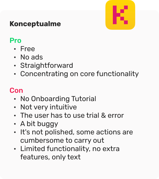
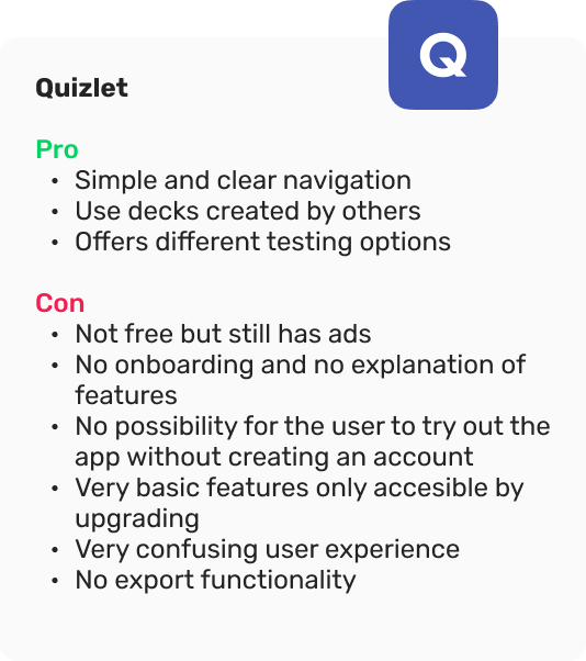
Competitive Analysis
I looked at a few competitors to see the common solutions regarding flashcard apps, and also to discover any usability issues that could be improved. I discovered the pros and cons of each service, did a UX analysis on their products and summarised my findings.

User Research
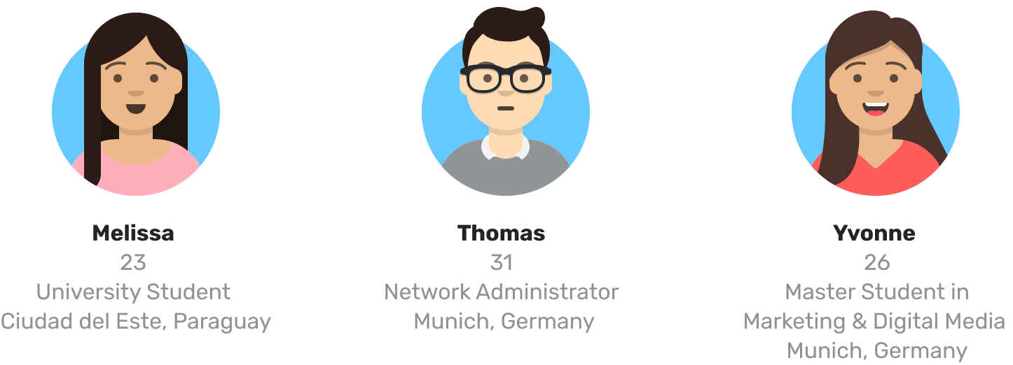
I interviewed three people about how they learn, their motivations and frustrations, and their experience with learning apps.
I learned that procrastination, information overload, lack of focus and motivation, and rote memorisation are big problems for our potential users.
Define
I analysed the interview answers and synthesised the data into a User Persona – meet Coco.
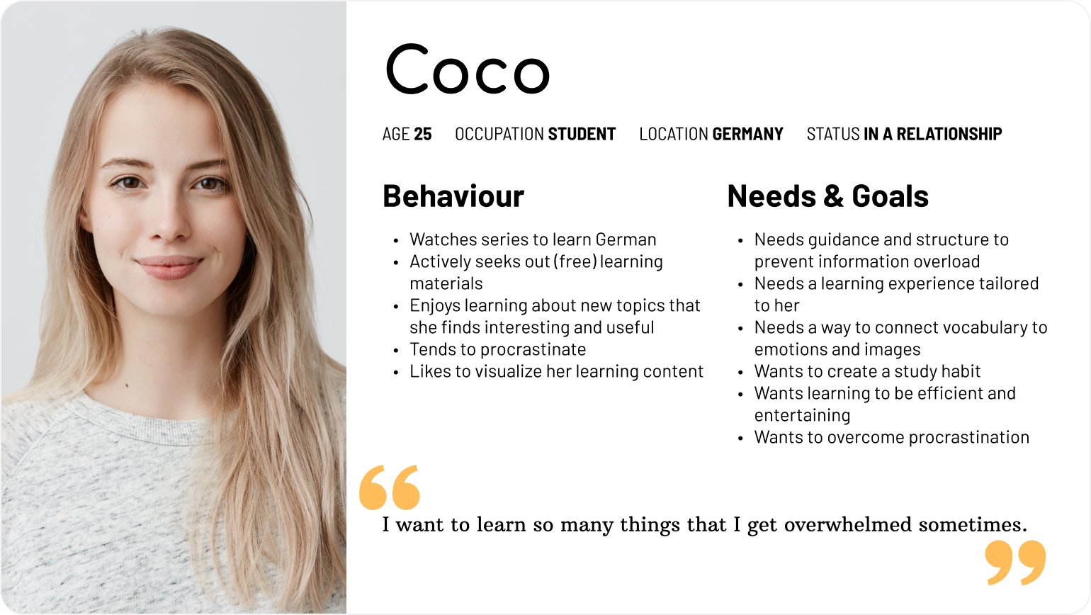
So what problems does Coco face?
- Coco is a university student in a foreign country who loves learning about new things.
- She is a visual learning type and doesn't like a one-size-fits-all approach to learning.
- She suffers from information overload.
- She tends to procrastinate.
- She needs to feel she is making progress else she loses motivation.
Problem Statement
How might we design a mobile app that helps Coco learn and remember new things consistently in a fun way without overwhelming her?
To explore possible solutions I wrote a few User Stories.
As Coco, I want...
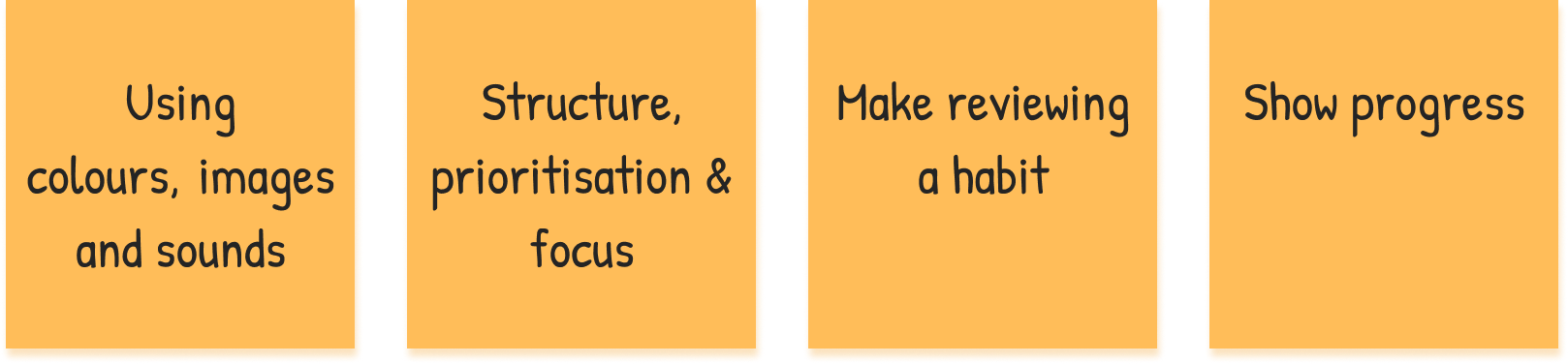
- daily reminders, so that I can create a study habit.
- to be able to use drawings and images, so that learning feels more engaging.
- to be able to structure my learning material, so that I can prevent information overload.
- to see my progress, so that I stay motivated.
Solutions
Design
Information Architecture
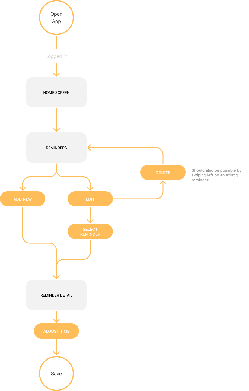
Based on the defined features I was able to start thinking about the app's structure. By drawing flows I explored different navigation possibilities.
Setting a Reminder
Adding content to a card
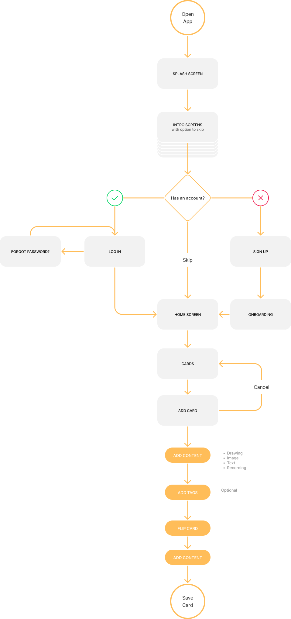
The User Flows in turn helped to define the number of screens I would need to design.
Wireframes
Next I did some exploratory sketching in order to visualise the solution, generate ideas and further define the the user flows.
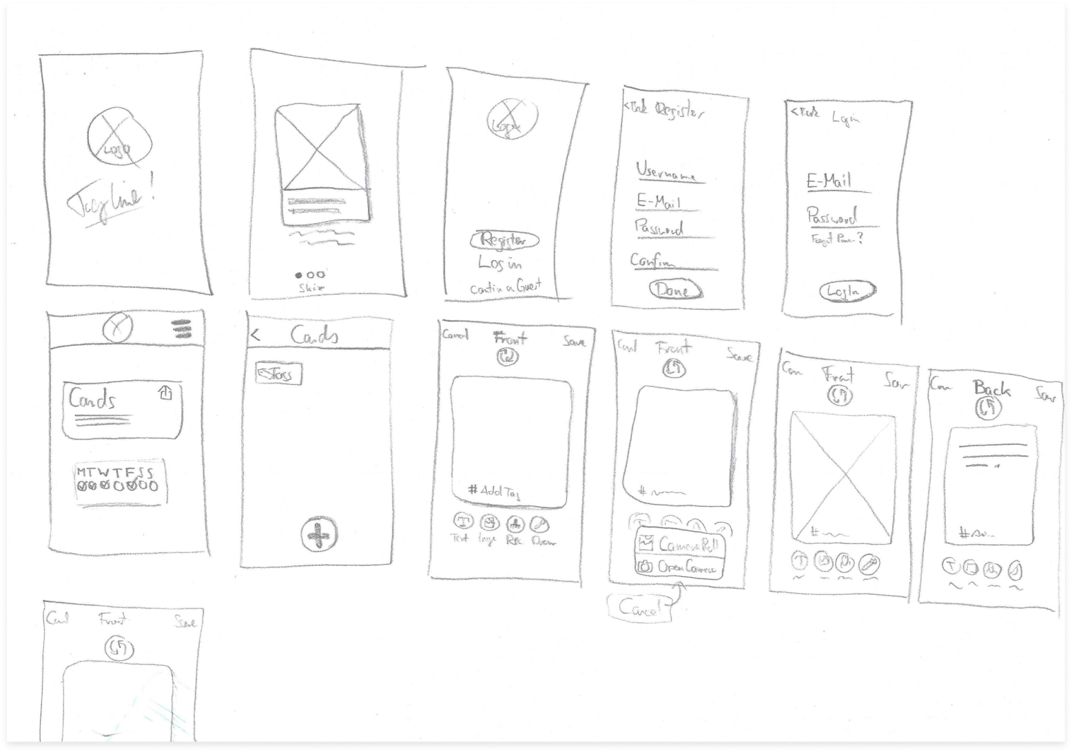
Finally I created a paper prototype to validate the concept.
Test
I conducted four usability tests, testing the following tasks:
- Complete the sign-up process
- Add an image to a new card
- Complete a testing session
- Add a reminder
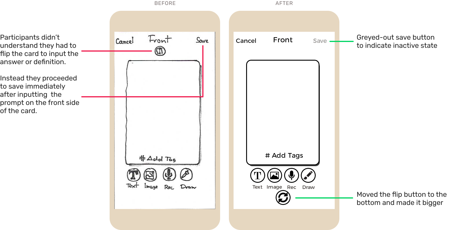
The two main problems were
- users tried to save a card without adding content on the backside
- users not finding where to start a review session
I fixed those problems by greying out the save button, making the flip button bigger and redirecting users to the home screen where they see the test button right away.
Logo Design
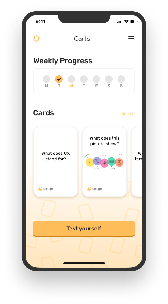
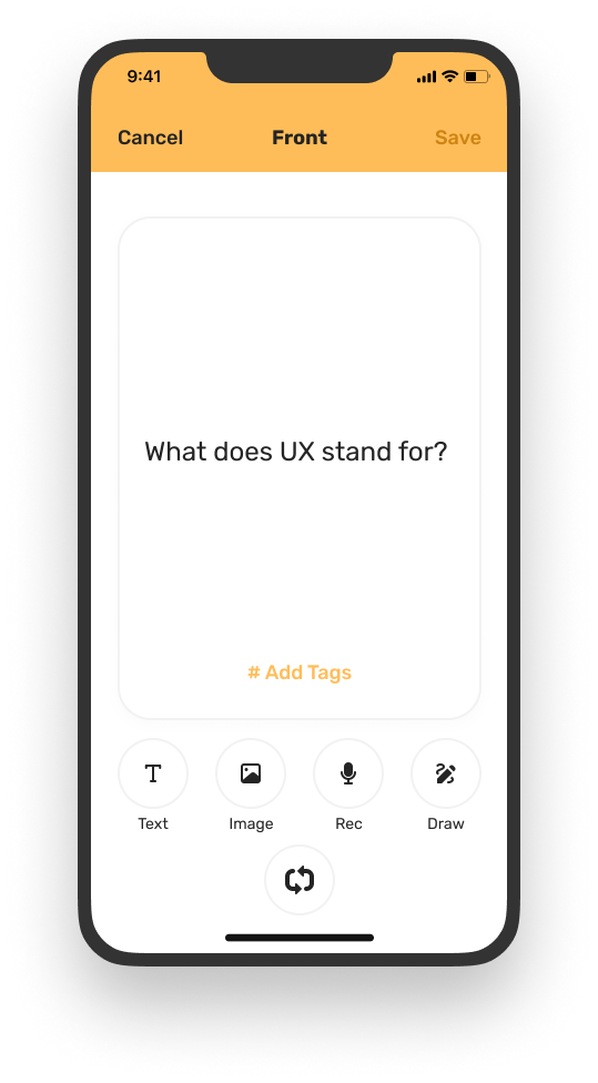
Final Screens
Next Steps
- Create a higher-fidelity prototype
- Do a second round of user testing
- Add secondary features
Thank you!
Interested in working together?